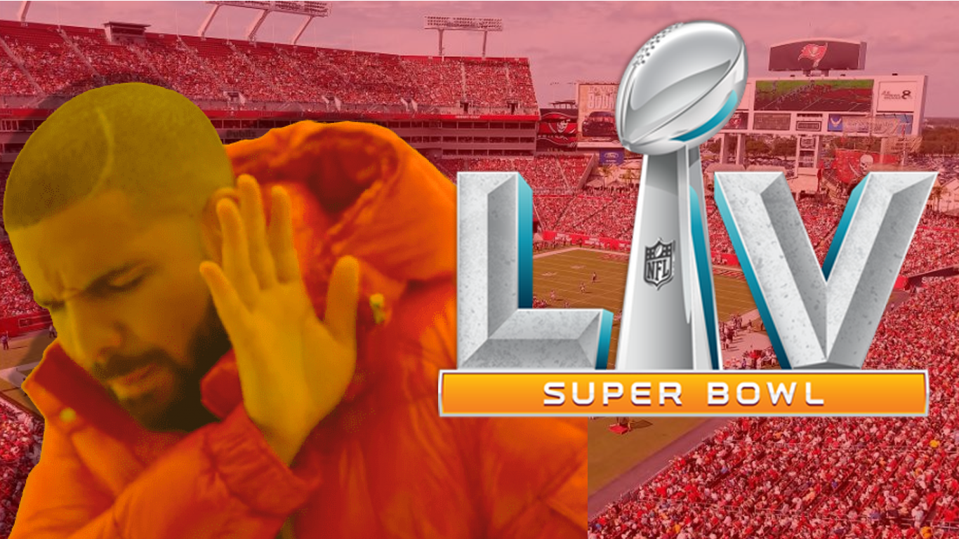
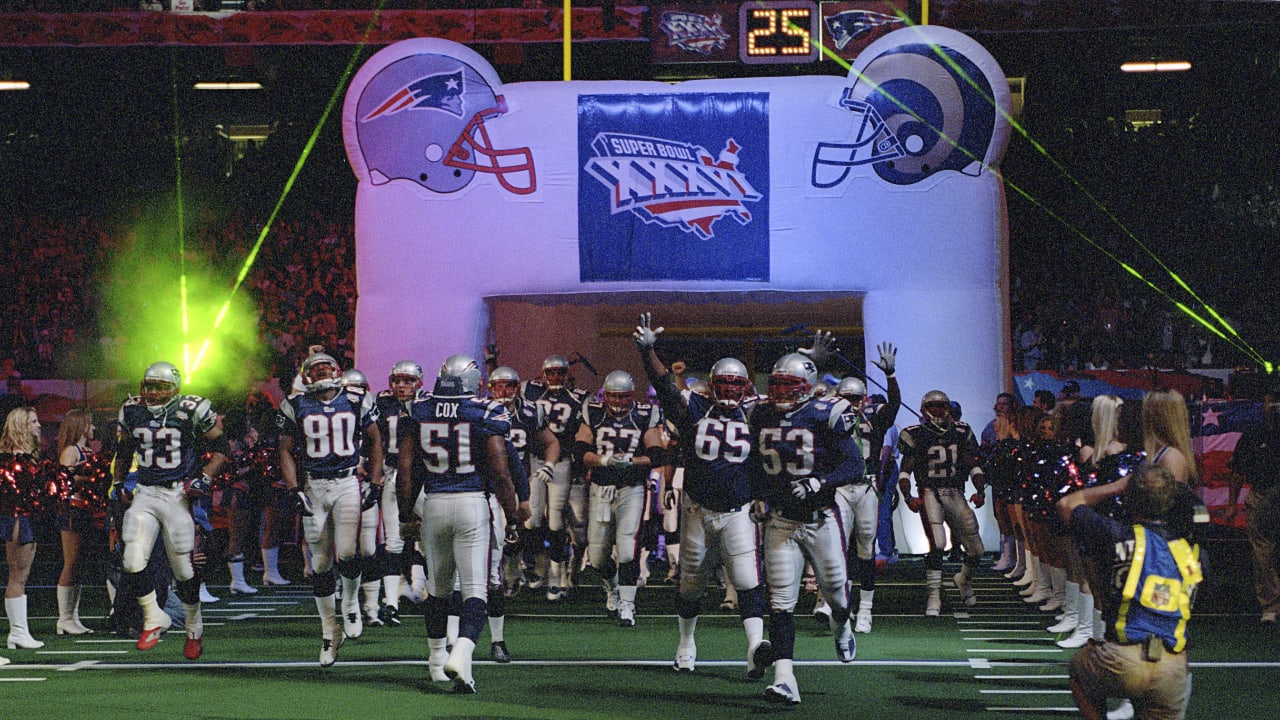
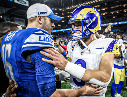
The Super Bowl is synonymous with extravagance. Massive crowds, tickets the price of a small mortgage, big rings, and the shiny trophy. For years, this egregiously “over-the-top”-ness was reflected in the branding.
The Super Bowl: The Best Logo in Sports
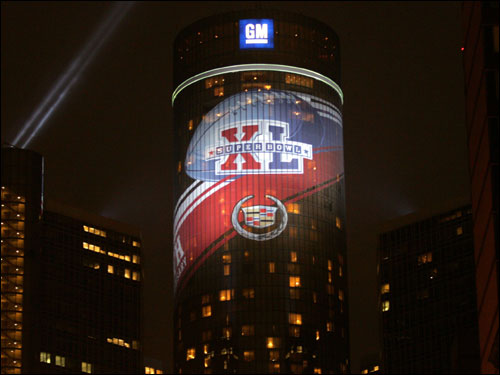
For years, each Super Bowl logo was customized for the host city. The logos peaked from Super Bowl 27 to SB 49. Super Bowl 33 paid homage to Miami’s iconic neon lights. Next, the American flag over a 3D map of the United States was a tribute to 9/11 for Super Bowl 36. Each and every logo featured something unique. The colors were bright. The designs were beautiful. Sadly, starting at Super Bowl 45, the logo lost its fun.
The Early 2010s Shift

The Super Bowl relegated itself to silver numbers around the Lombardi Trophy. The number of the game – and the trophy. Could it get any more basic? The logo deviated slightly for Super Bowl 50 – but it was only a gold “50” and not much else. The NFL decided it was time to update the logo starting in Super Bowl 51. It is almost the same format.
Why We Need Amazing Logos Again
This shift to minimalism has killed the Big Game in many aspects. The NFL chooses a host city every year. Each city and stadium is different. Miami is no Atlanta. The logo separates their Super Bowl from others. It gives that city a memory of it forever. It is their big game – nobody else’s. A cookie-cutter logo takes that away from the city that has put in hundreds of hours of work to make the game a success.
It’s All About the Money (and Fashion)
Second, changing the logo could result in an increased stream of revenue from merchandise. Die-hard supporters of the winning team or NFL superfans are guaranteed money. However, with an improved logo, the league can unlock an entirely new market: people who don’t care about football.

Evidently, liking a particular band, sport, or artist doesn’t matter in today’s fashion. If it looks nice, people will wear it. Imagine an orange tie-dye shirt with palm trees surrounding a unique Super Bowl LV logo. The NFL will not be able to make enough of them. Other merchandise like pennants, flags, posters, and more will have more appeal. The NFL is a money-hungry business. Realizing this untapped market can be amazing for the brand.
The Trickle-Down into Other Leagues
The NFL isn’t the only brand to have this happen. The NBA is rife with overly simplistic logos for teams and has killed the Finals branding in recent years. The MLB had a nice redesign back in 2015 but has gone overboard themselves. The only league that has kept clean consistency is the NHL.
I feel like other leagues have tried too hard to emulate it. This is not to discount brand recognition. However, the recognizability of the big game comes from it being exactly that: the big game.
Share This Story, Choose Your Platform!
Related Posts
Detroit’s First All Digital Sports Network!
Listen to Your Favorite Shows LIVE each and every weekday. Download the Woodward Sports App Today!