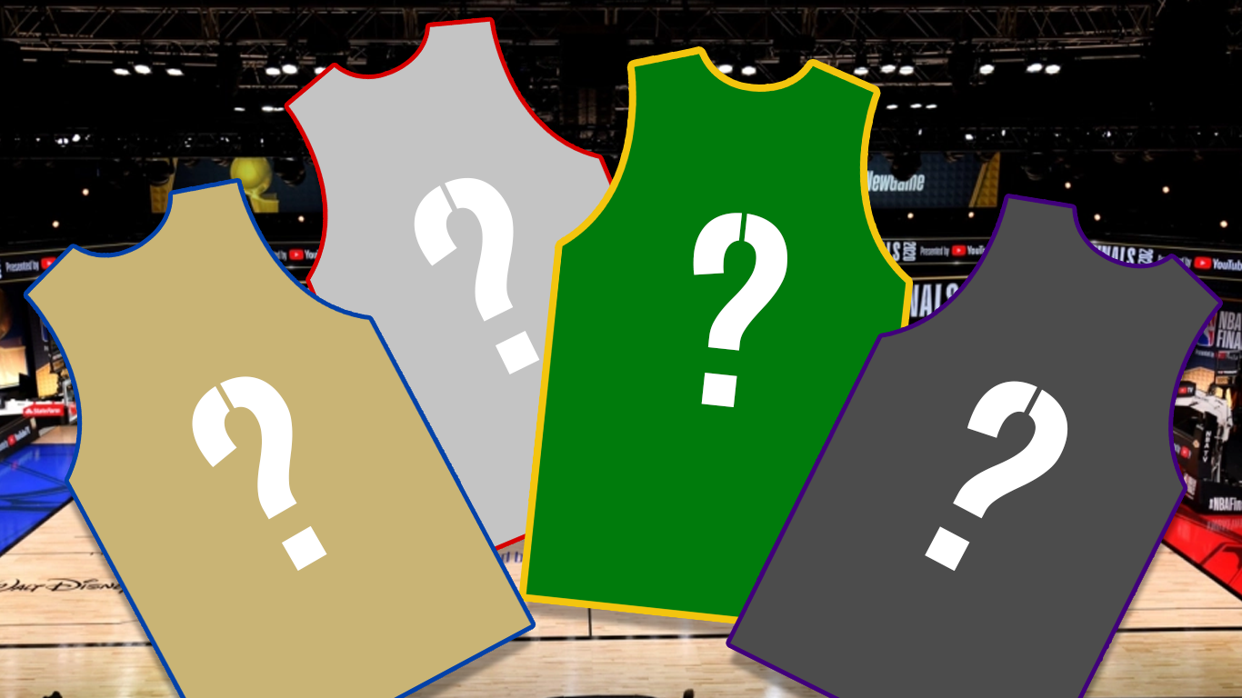
On Friday, I looked over the first four leaked NBA Earned Jerseys courtesy of UniSwag. The Nets, Bucks, Raptors, and Heat unis were all subject to criticism. Now, we delve into four more uniforms: the Lakers, Clippers, Jazz, and 76ers. Let’s start with the reigning champs, the LakeShow…
First, the Los Angeles Lakers Jersey
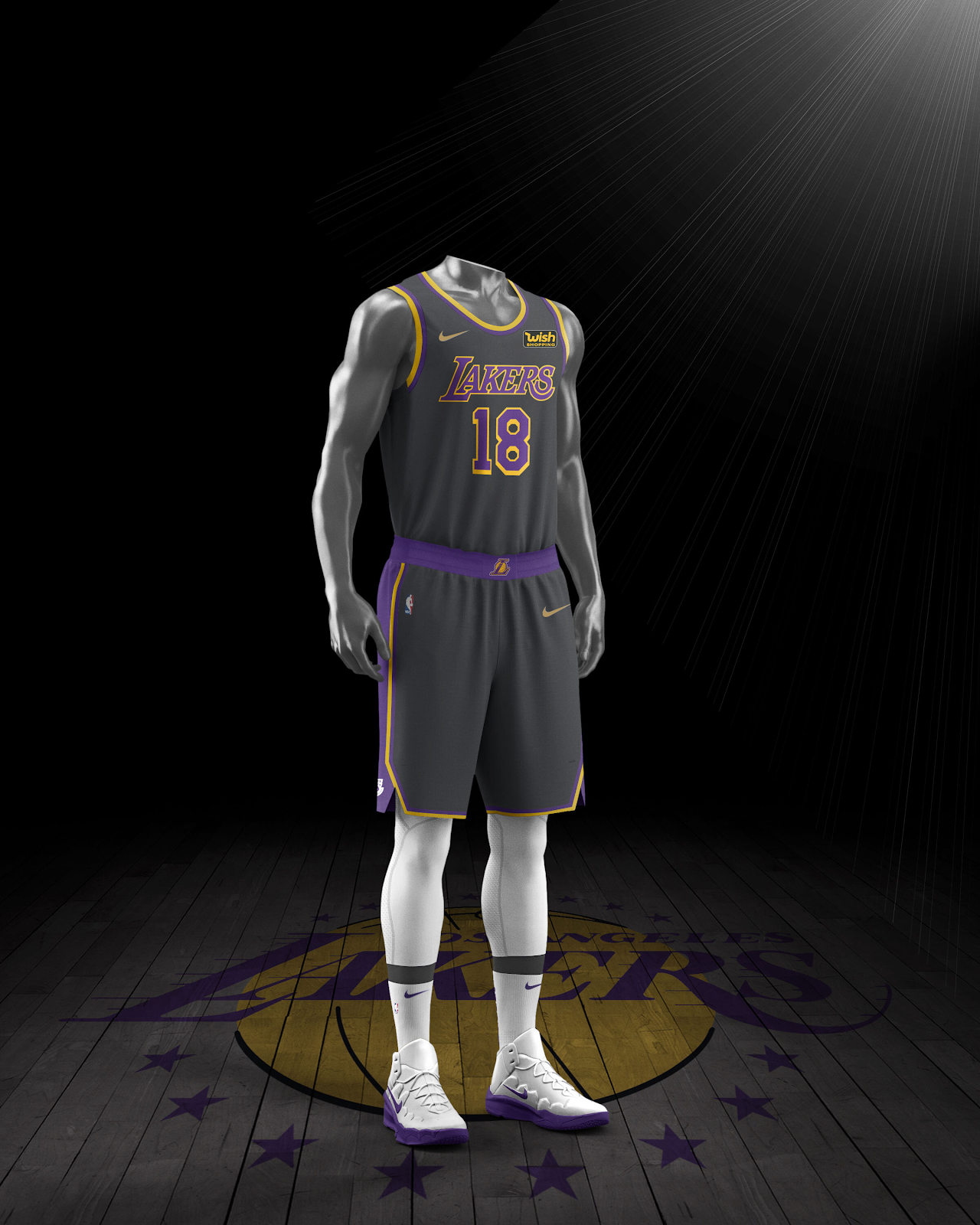
The Lakers’ iconic lettering looks good over almost every color. Their Black Mamba jerseys, the iconic purple and gold, and white. The one thing it doesn’t seem to fit over is dark grey. I feel like the stark contrast on these uniforms is good in theory. However, it does not do as well in execution. The fact the Wish logo sticks out so much on these is ironic – they do look very cheap.
Second, the LA Clippers
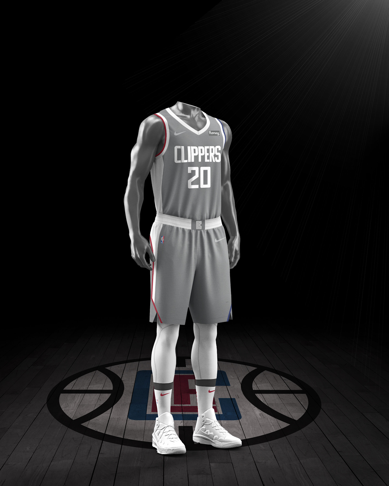
Next, the Lakers’ arena-mates: the Clippers. I like these jerseys much better than the LakeShow’s uniforms. But, just a little more color could have sold these jerseys more for me. Perhaps an outline of red on the letters and numbers. Perhaps some red and blue on the waistband of the shorts. However, I really would have preferred they pay homage to the clipper ships they derive their name from. That is such an untapped concept. Overall, these are very solid jerseys but just need a little more pop.
Third, the Utah Jazz Jersey
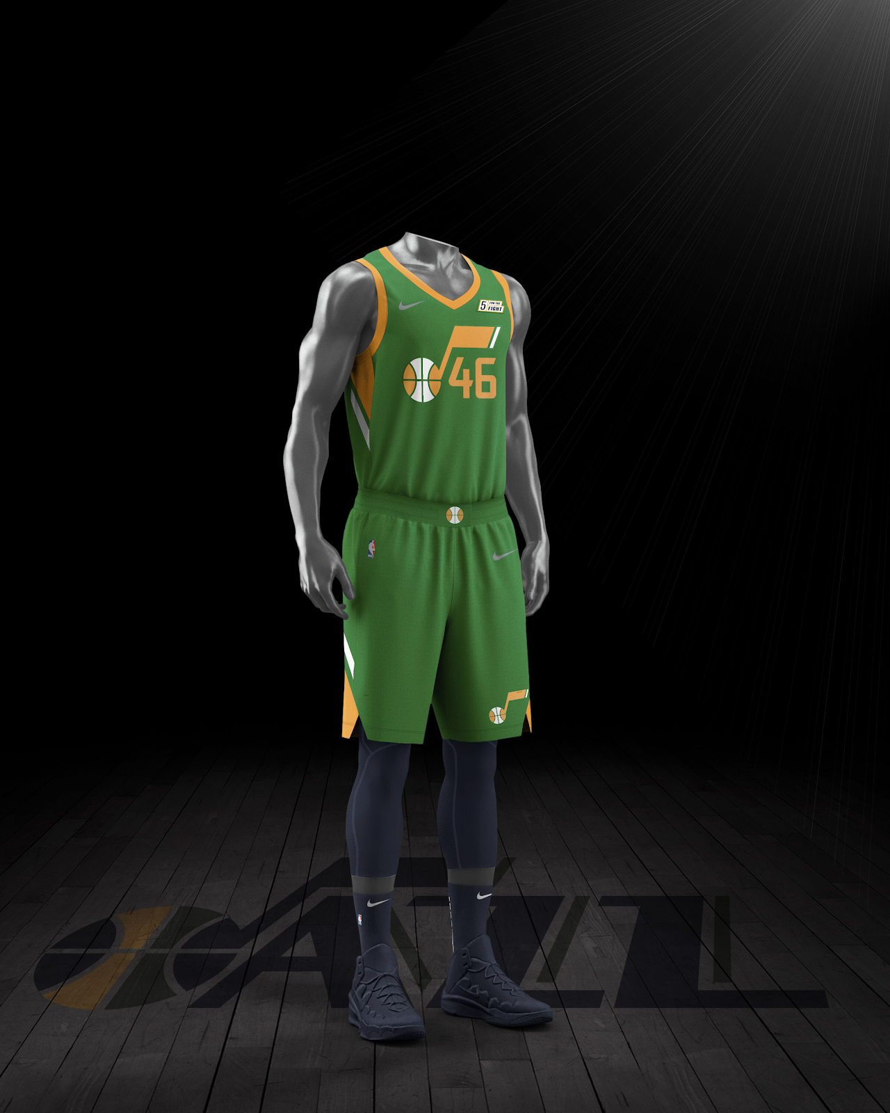
The most underrated primary color for the Jazz has been their iconic green. They bring this together with the white-and-yellow music note. The logo has been used as the centerpiece of many jerseys in recent seasons. The team got it perfect here. The blue socks and compression pants match with the color scheme. It reminds you of the long stem on the note. If I was to redesign it, I’d like to see the outline of mountains with the Jazz logo as a combination of both eras. Yet, I cannot wait to see the team debut this uniform soon.
Fourth, the Philadelphia 76ers
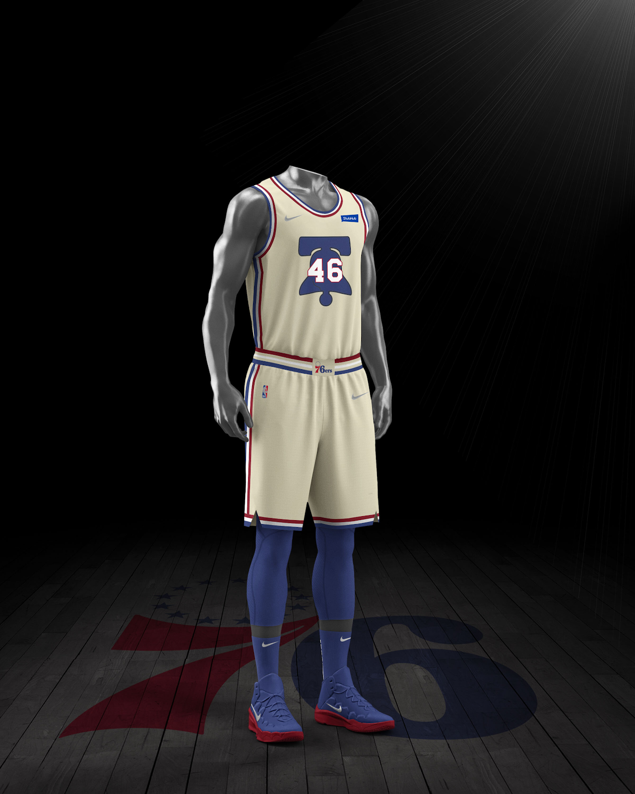
The off-white, cream color the Sixers have opted for on their jerseys is a great nod to the city’s history. It evokes thoughts of the Constitution and colors of clothing in the 1700s. The entire jersey looks great. The numbers on the bell overlap a little bit, which I didn’t like at first but really appreciate now. But, I dislike the font that was used for them. This font looks like a default 2K would give me on MyNBA. If they changed that, these might be the best jersey out of the whole collection.
Share This Story, Choose Your Platform!
Related Posts
Detroit’s First All Digital Sports Network!
Listen to Your Favorite Shows LIVE each and every weekday. Download the Woodward Sports App Today!